Guidelines Display Onsite campaigns

On this online guidelines page, you’ll find the basic rules we apply when creating all bol Retail Media Onsite Display campaigns.

matroesjka

Colour palette

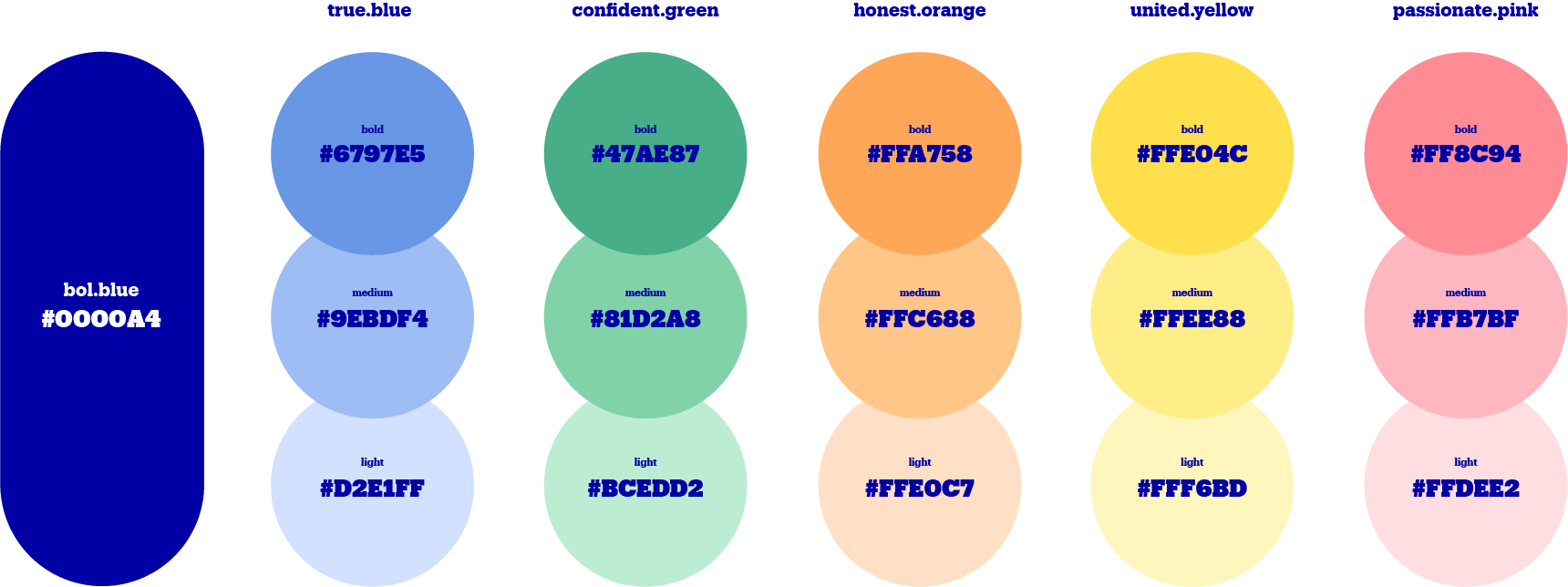
For the background colour, the designer will choose from bol’s colour palette. This choice is made to align with the advertiser’s style and to match the campaign message, unless a specific preference has been clearly stated in the briefing. The visual elements will always use a different shade from the same colour family.

Colour exceptions

In some cases, it’s not possible to select a background colour. Established campaign styles from bol—such as the Bol-7-Daagse and Black Friday—have fixed designs with dedicated guidelines. In these cases, the colour scheme is predetermined.

kleurenpalet

Copy

The copy is the message we place on the banner. Within bol’s brand guidelines, we use a maximum of 36 characters (including spaces and punctuation). Of course, one character more or less can always be discussed if needed.

What not to include in the copy:

  • The punctuation marks ‘!’, ‘?’, ‘#’, and ‘:’.
  • The word ‘euro’ written out in full.
  • Abbreviations (except for o.a. and t.w.v.).
  • English terms (except for brand names and slogans).

The colour of the copy must always be bol communication blue.*

*Exceptions apply to predefined bol campaigns with an adjusted design, such as Black Friday.

Sentence structure & text layout

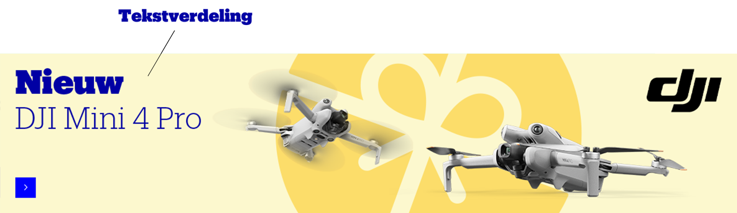
  • The copy is always placed on the left side of the banner.
  • The copy consists of a title and a subtitle.
  • We prefer not to break up words. So, try to avoid using long words in the copy, such as household cleaning products, dishwashing cycles, etc.

Disclaimers

The following types of disclaimers are always allowed:

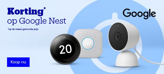
  • on the most shown price” when mentioning discounts.
  • Compliance disclaimers for the computer store.
  • Legal disclaimers related to health products.

Note: All other disclaimers are not allowed and will be rejected.

Discount percentages

Only rounded percentages are used in the copy.

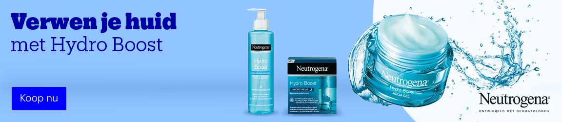
voorbeeld ad
voorbeeld ad

Visuals

Mix of product and lifestyle imagery

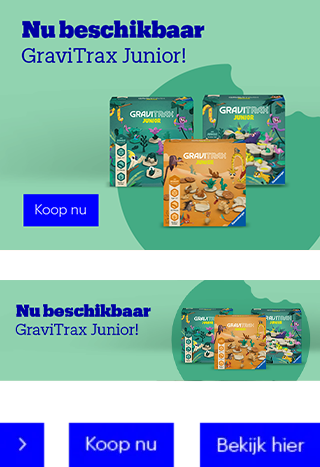
The banner can feature a combination of product and lifestyle images.

All product and lifestyle images must be:

  • High resolution
  • Assigned a priority
  • Relevant: avoid using an overload of visuals

For certain smaller formats, no lifestyle image is placed on the banner. Sometimes, there’s limited space to display all products. In these cases, our designers make a well-considered selection of which products to include.

voorbeeld ad

Product images only

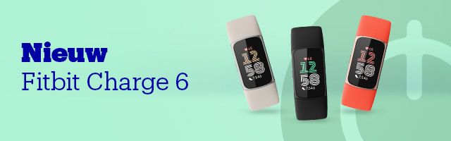
If no lifestyle image is available, the designer will use our design language. This form will be carefully chosen to match the style and the products featured on the banner.

voorbeeld ad

Logos & Labels

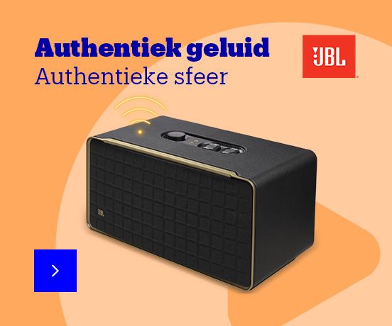
We always place logos in a fixed position. A maximum of 2 logos may appear on a banner.

The following logos and labels are always allowed:

  • Official product and/or brand logo
  • Labels from the official bol visual identity

Labels can be used to communicate a special promotion or campaign message. We distinguish between 2 types:

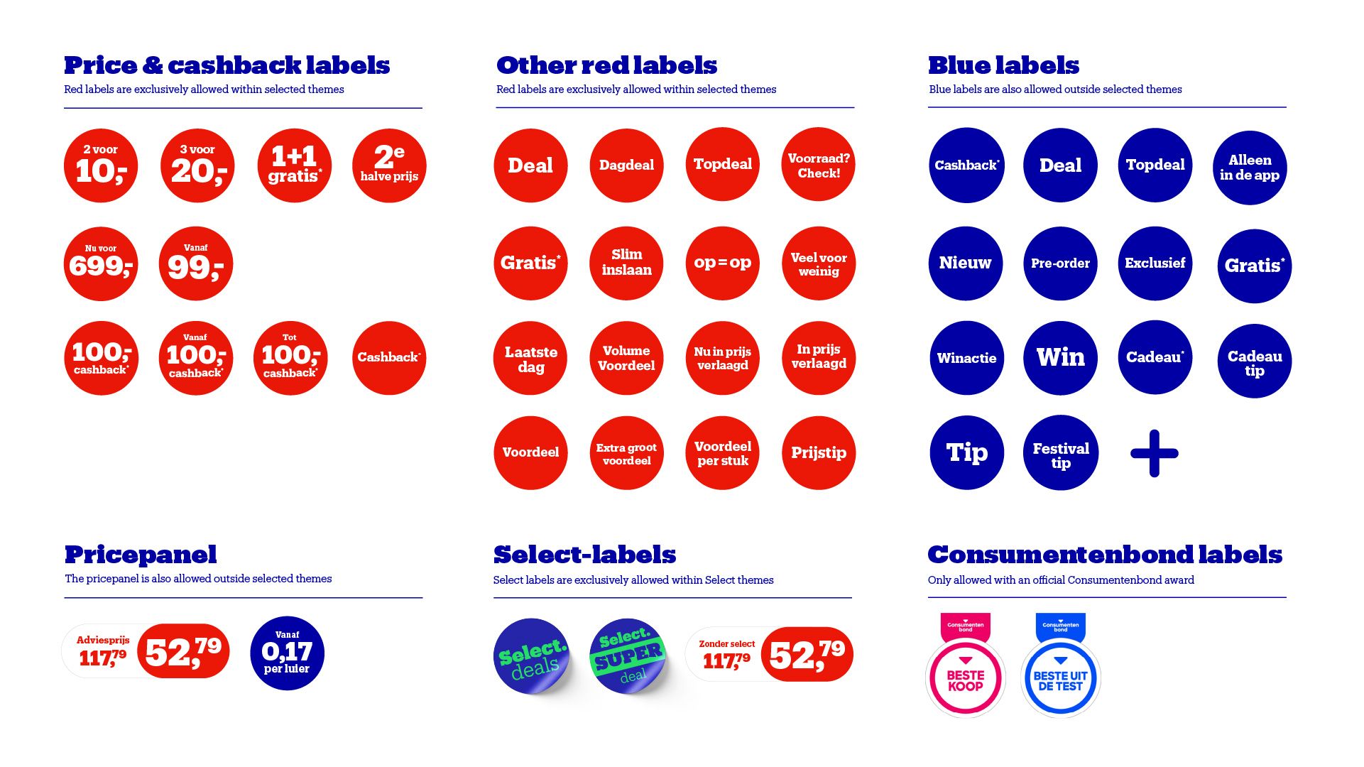
Red labels

Only allowed during bol promotion or themed periods, such as the bol 7-day sale, Sale Solden, and Black Friday. Red labels are used to convey a strong commercial message, such as discounts or cashback offers.

  • For campaigns where red labels are allowed, a fixed design is applied across all bol banners.
  • On regular banners, red labels are not permitted.

Blue labels

Blue labels are used to reinforce the message of a campaign, for example to highlight a launch or a prize promotion.

  • Blue labels can be used throughout the year.
  • Price-off or brand claims are not allowed when using them.

Note: Quality marks, certification labels, and rating labels are only allowed if they come from the Consumentenbond.

Overview of all labels

Overzicht van alle labels

Design elements

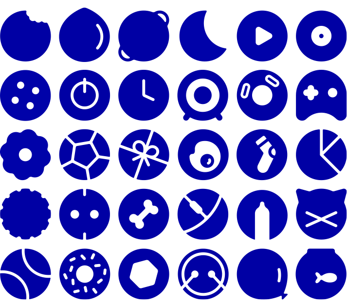
When only product images are shown on the banner, we use category-specific design elements. These are carefully chosen to match the message and/or products on the banner. During holidays or special occasions, we adjust the design elements to fit the theme.

iconen
iconen

Call to action

3 types of buttons

We use standard buttons across our banners. The chosen button will be used consistently across all sizes, so you select just one for the entire banner set. In some formats, only the standard button fits, or no button is used at all—these are formats that appear exclusively on the mobile site.

The position of the CTA button is fixed.

voorbeeld ad

Other exceptions

MHP formats

There are two MHP formats with stricter rules: 214x230 and 276x230. These always include the standard CTA ‘>’ and do not feature any lifestyle images. In these formats, only the category-specific shape language is used, placed in a fixed position.

voorbeeld ad

Mobile Formats

There are two formats with stricter rules. In the 214x230 format, no logo is displayed and the standard CTA ‘>’ is used. In the 320x100 format, neither a CTA button nor a logo is shown.

voorbeeld ad